Fashion Dashboard: Data-Driven Design Innovation
Interactive Dashboard Prototype

Data Visualization
Persona Development, Affinity Mapping, Information Design, Prototyping
Year:
2020
OVERVIEW
An interactive dashboard concept using adidas as a practice case study to explore how data visualization could bridge the gap between creative design teams and data-driven business goals. This academic project focused on translating complex sales data and user personas into actionable insights through thoughtful information architecture.
Project Type: Academic Design & Research Project
Timeline: Fall 2021
Team: Elan Suder, Monica Chang, Tianyou Zhang, Yue Yuan
Course: Interaction Design Studio 1
Deliverables: Process book, Figma prototypes (lo-fi through hi-fi), physical control design, final presentation and pitch
ROLE
WHO IS THIS FOR?
Target Users: Design and marketing teams at adidas, a global fashion company, who need to balance creative innovation with data-driven decision making.
Fashion design teams often worked in silos, with designers focusing on creativity while business stakeholders demanded data-driven decisions. Sales data, customer reviews, and market trends existed separately, making it difficult for teams to see how their creative work impacted business outcomes or how data could inspire innovation rather than constrain it.
RESEARCH
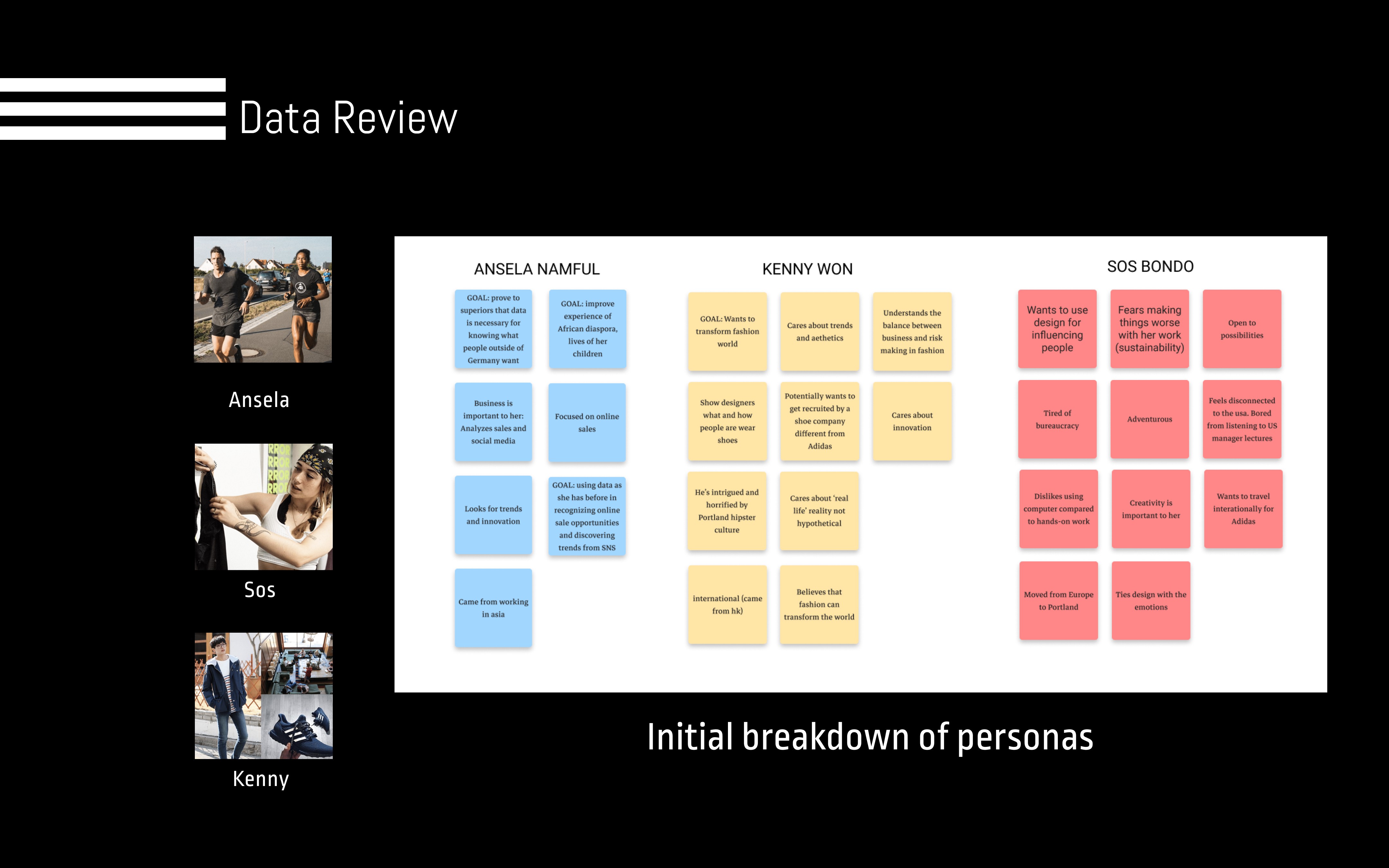
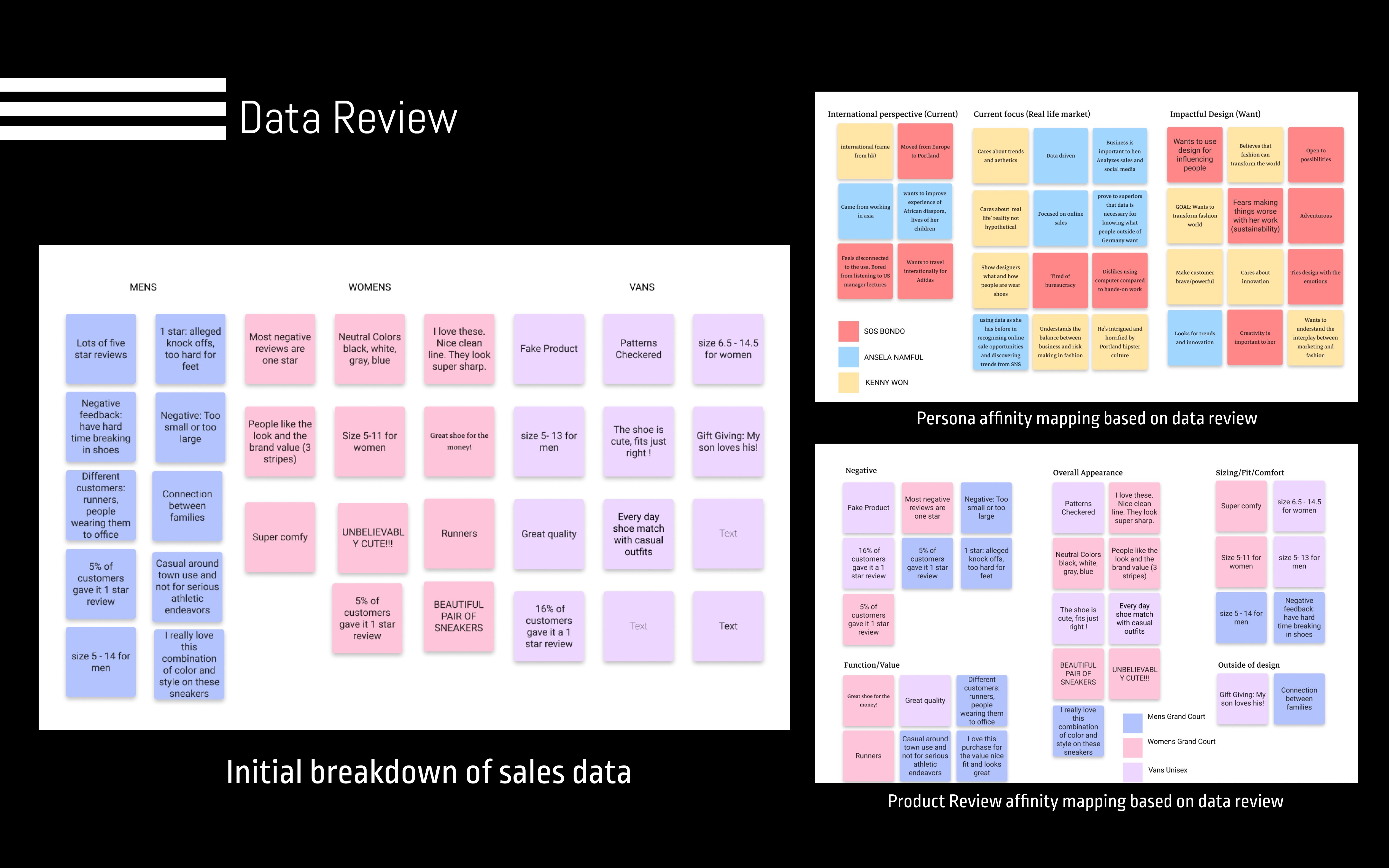
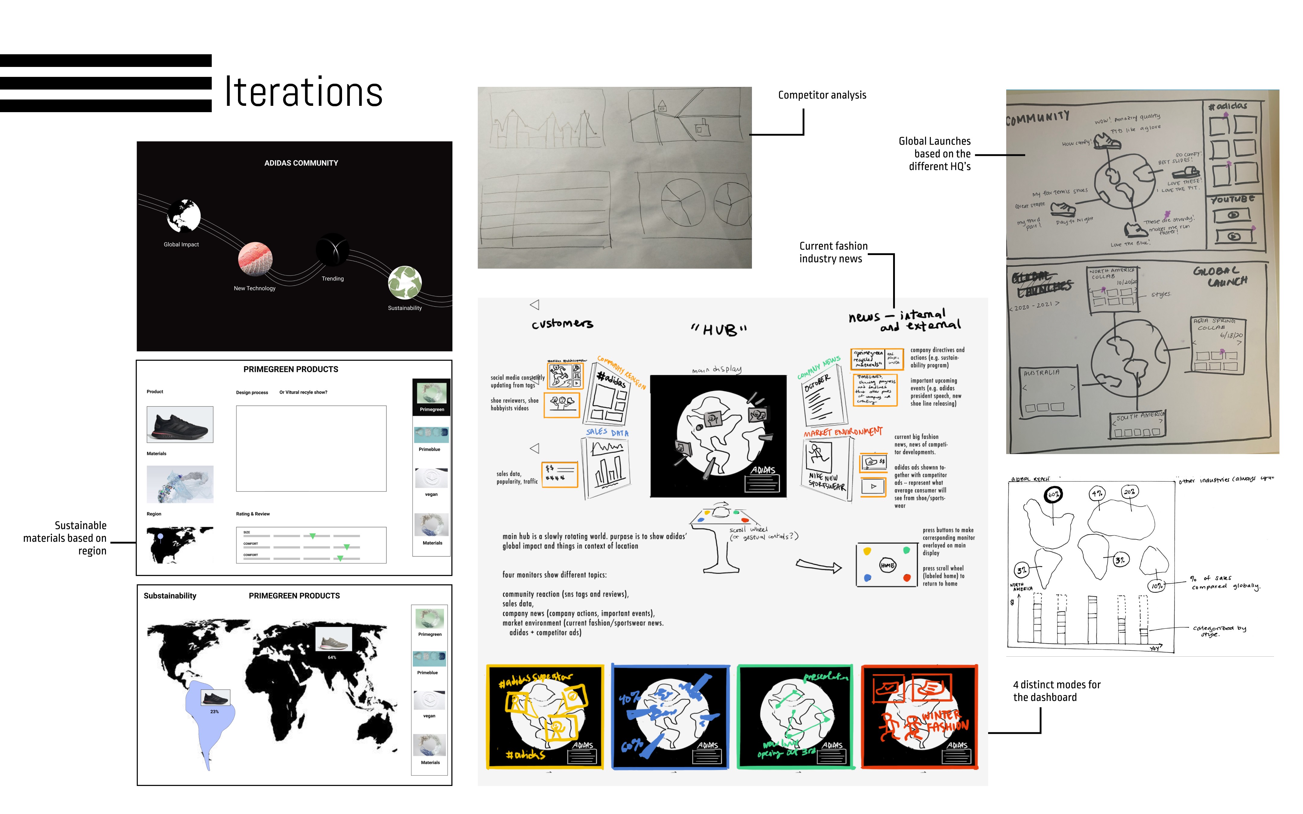
We developed three personas to represent different stakeholders: Ansela (data-driven executive), Kenny (marketing lead balancing creativity and metrics), and Sos (designer motivated by innovation and sustainability). Through affinity mapping of persona characteristics and sales data, we identified overlapping goals: all three wanted global innovation, but were hindered by fragmented information access.
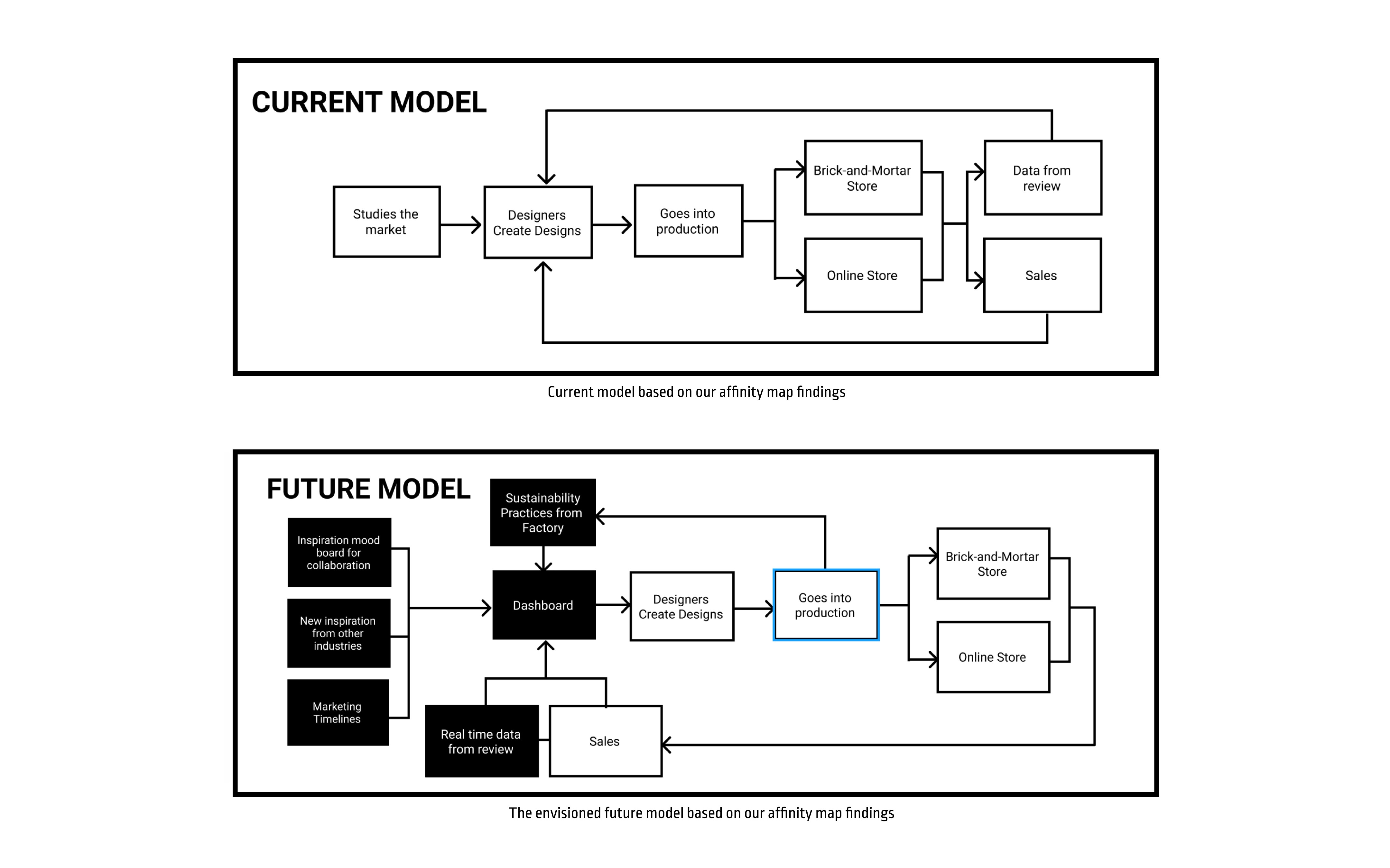
Our current state model revealed designers studied markets piecemeal, only seeing current reviews without understanding broader patterns. The future state needed to consolidate trend forecasting, sales performance, sustainability metrics, and global market insights into one cohesive view.
SOLUTION
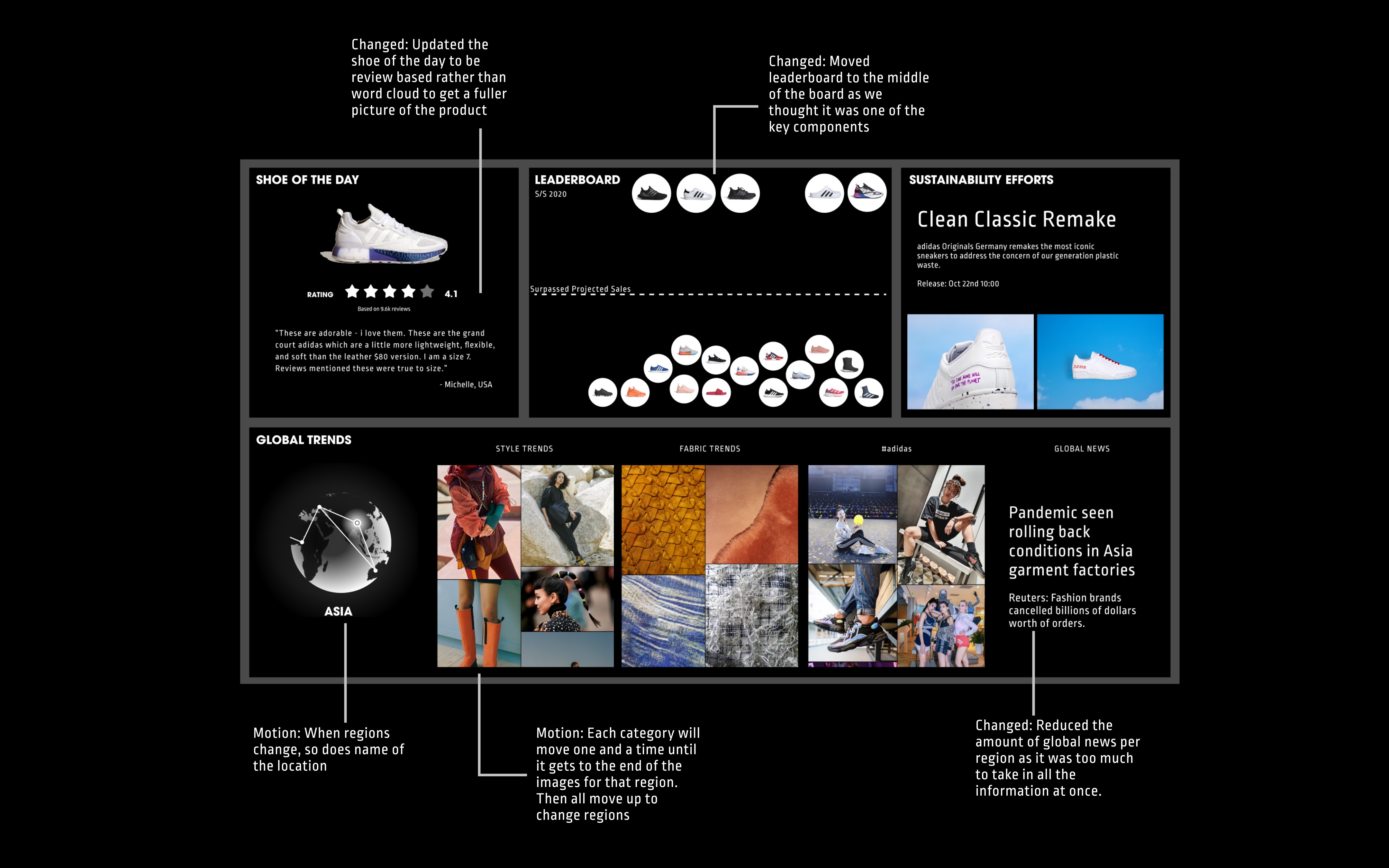
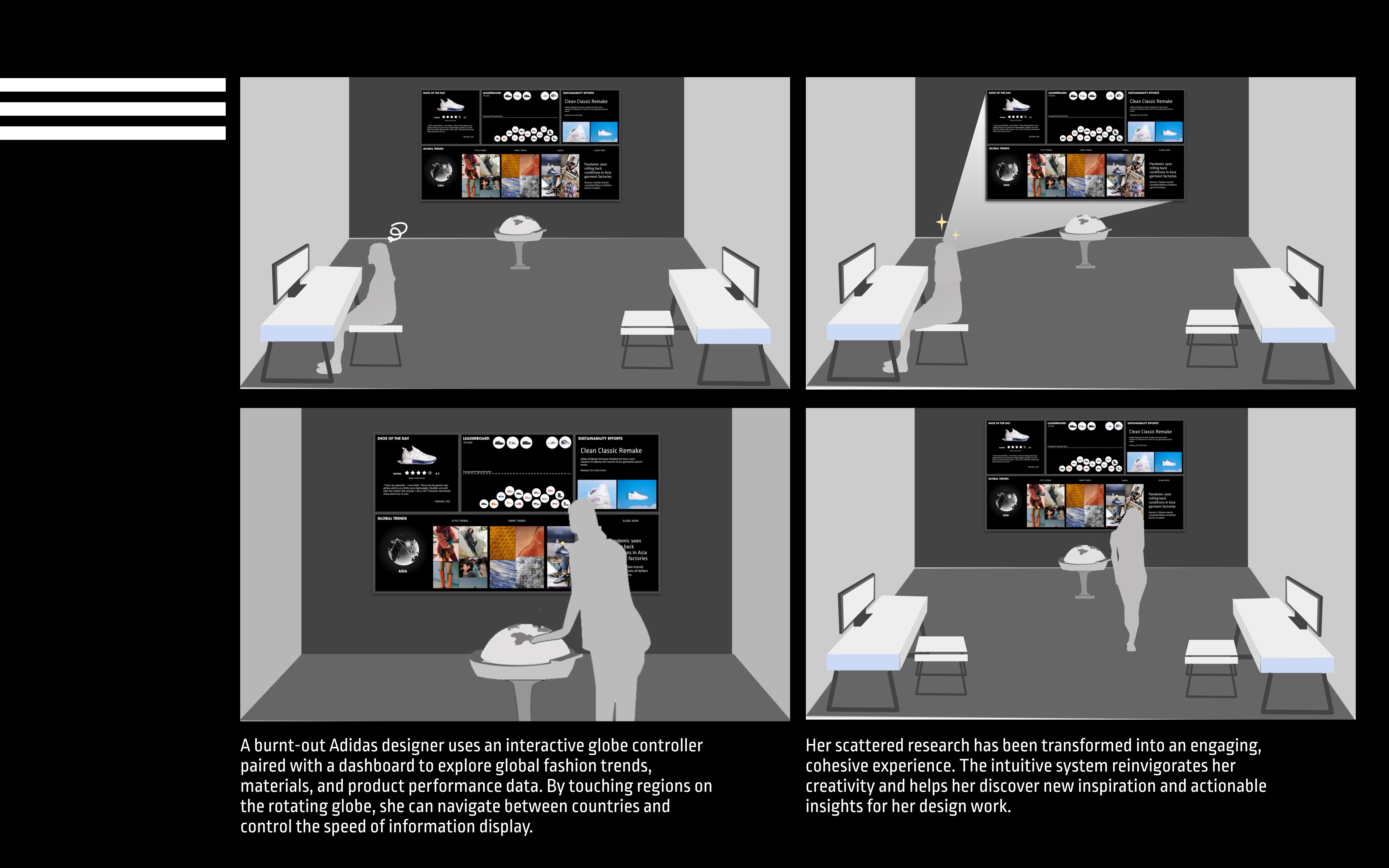
A wall-mounted dashboard for the design studio featuring rotating global trend visualizations organized by region, a leaderboard showing product performance to create healthy internal competition, "Shoe of the Day" with customer reviews to humanize data, sustainability progress tracking, and fashion news from multiple markets.
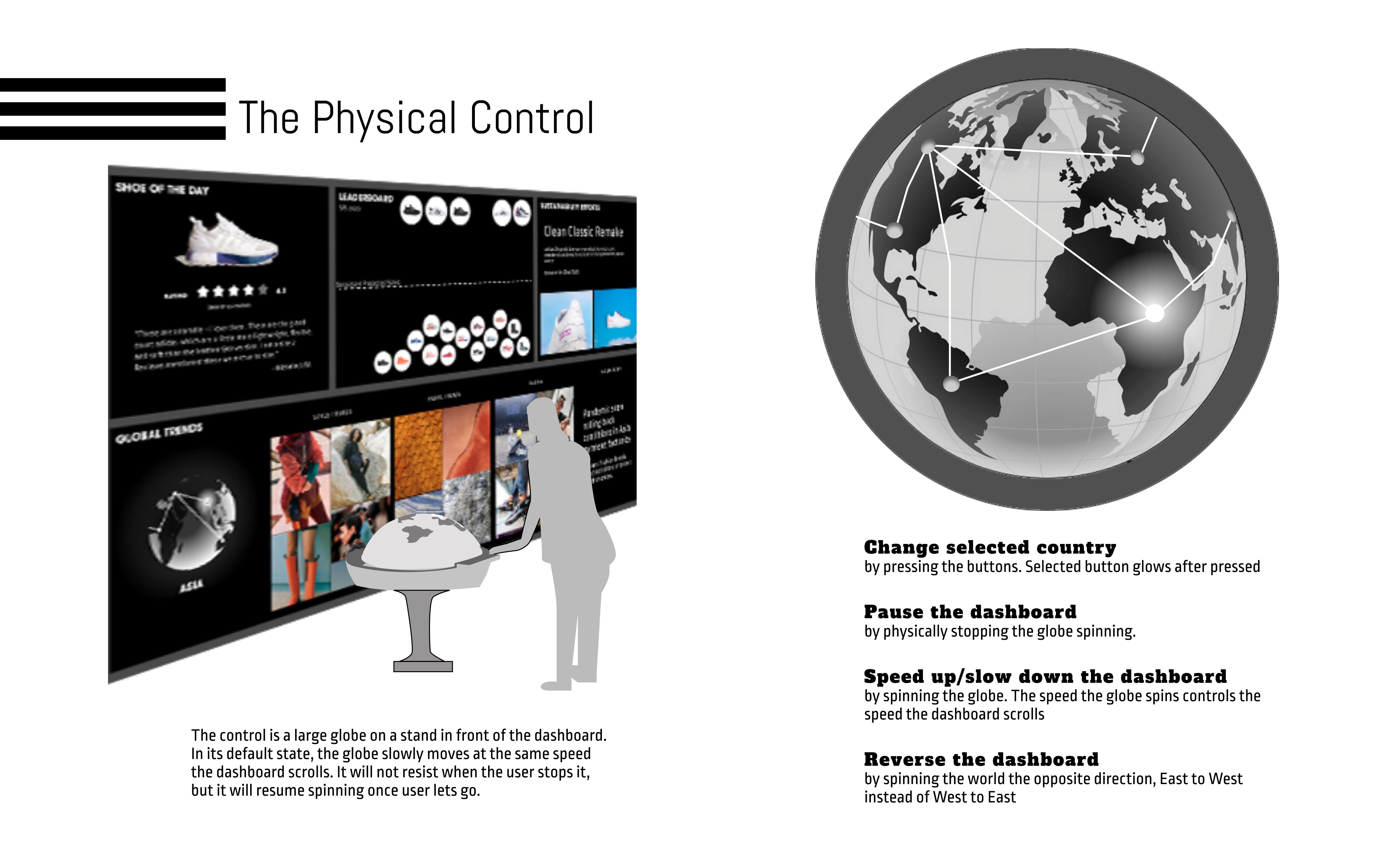
The dashboard uses motion intentionally, slowly cycling through regions to provide ambient awareness without requiring active interaction. A physical globe control allows users to pause, speed up, or change regions by spinning the globe, making data exploration intuitive.
Our dashboard does not demand much interaction, and our control is simple in turn. The following are the dashboard’s capabilities, made to be simple, elegant, and fun.
Key decisions included using word clouds and review highlights rather than dense charts, organizing information by geographic region to support global innovation goals, and balancing inspiration (trend images, news) with accountability (sales data, sustainability metrics).
WHAT NEXT?
I really love this project and feel proud of it to this day. I enjoyed the process of adding tactile interaction and visual delight to make data visualization more engaging.
Oftentimes in the UX/UI field, the focus is narrowed in on apps and websites, so being able to design a large-scale technological solution opened up my imagination to what the world of user design can encompass––it's almost like an art exhibit!